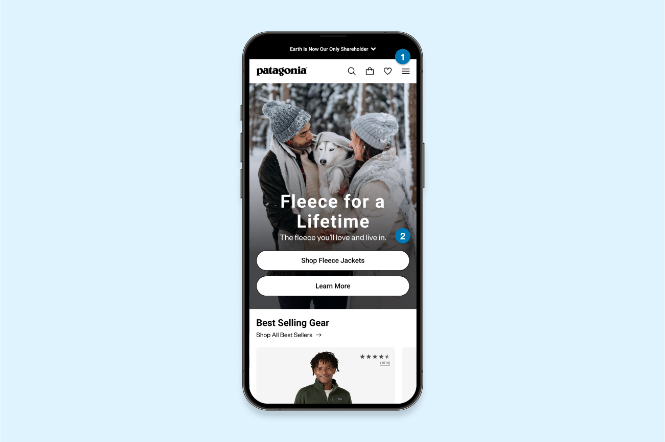
1. Navigation
- Current Issue: The navigation is difficult for users to access key features quickly.
- Suggested Update: Simplify the navigation by right-aligning key links, making them more accessible and user-friendly.
2. Header
- Current Issue: The header is cluttered, and small CTAs make it challenging for users to select their desired link.
- Suggested Update: Redesign the header with a simplified layout and full-width CTAs, ensuring users can easily make selections without frustration.

3. Product Cards
- Current Issue: The use of category cards instead of product shopping cards, combined with small CTAs, makes it difficult for users to navigate to specific products.
- Suggested Update: Introduce best-selling product cards with clear information and larger CTAs, allowing users to quickly find and access key products.
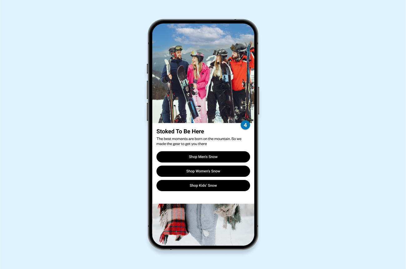
4. Storytelling & Product Integration
- Current Issue: Overemphasis on storytelling with little focus on products makes it challenging for users to navigate to relevant items.
- Suggested Update: Balance storytelling with product highlights and include full-length CTAs that guide users seamlessly to related products.
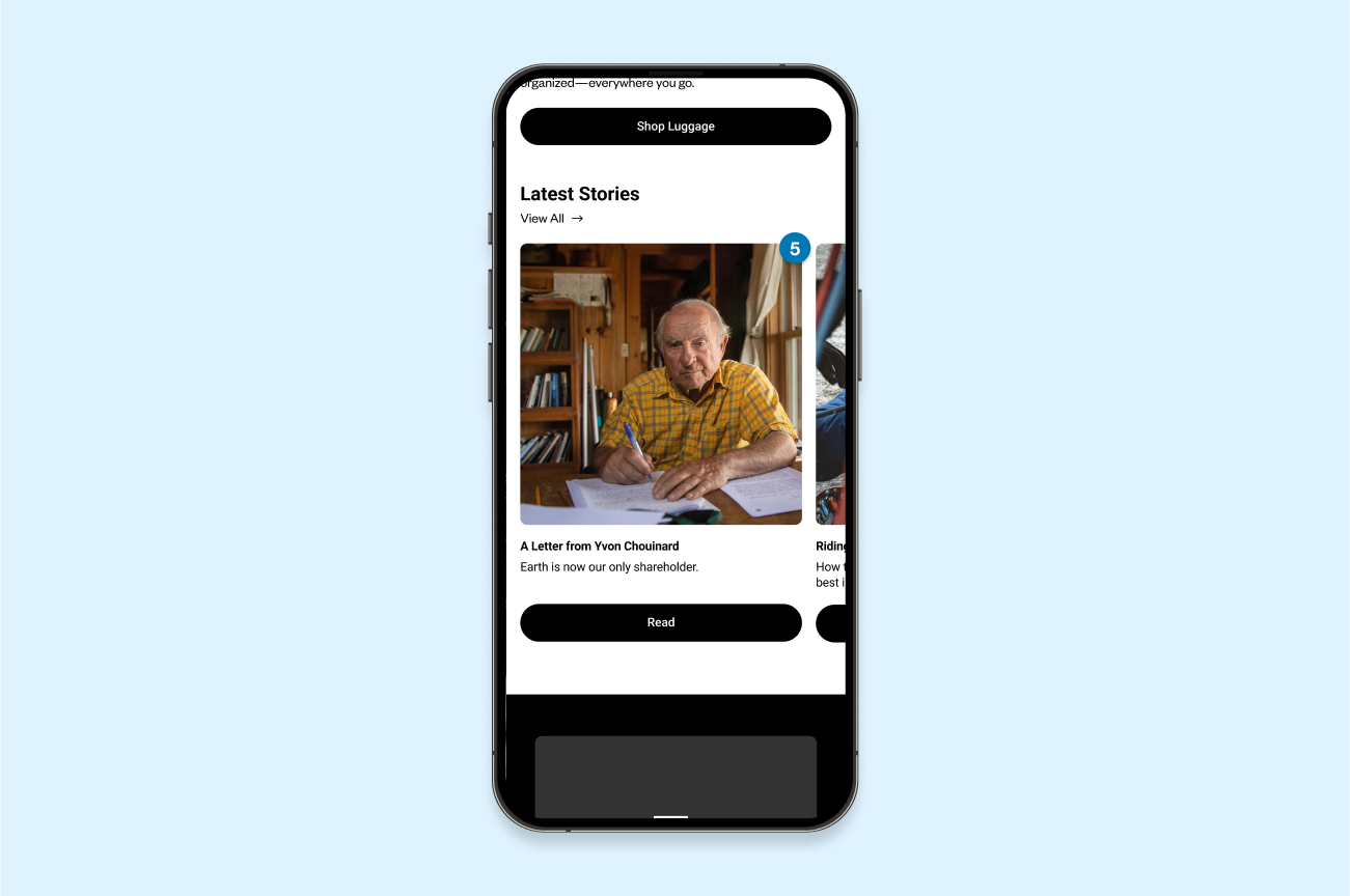
5. Blog Cards
- Current Issue: Inconsistent blog cards and small CTAs create visual confusion and make it hard for users to select desired blog posts.
- Suggested Update: Standardize blog card designs with consistent layouts, full-length CTAs, and short descriptions, enabling users to navigate quickly and efficiently.
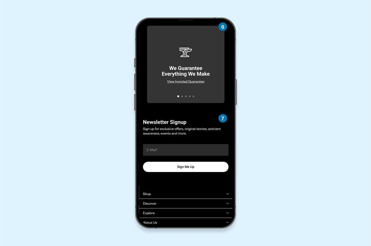
6. Initiative Section
- Current Issue: A stacked initiative section adds unnecessary length to the mobile page, requiring excessive scrolling.
- Suggested Update: Replace the stacked format with an auto-rotating initiative module, providing a compact, user-friendly way for mobile users to browse.
7. Footer
- Current Issue: A long mobile footer creates visual clutter and makes navigation difficult due to small CTAs.
- Suggested Update: Simplify and condense the footer, incorporating full-length actions that reduce clutter and improve navigation efficiency.